Tuesday, November 15, 2011

Risk

If you risk nothing,
Then you risk everything.


From Kobi Yamada’s Book “Live Good”
Author: Geena Davis

Treasure Trail

“Treasure Trail” has to be one of my favorite pieces that came out of the photography sessions with the model.  Again, a bit of a hybrid, with most of the black line work being completed in the mid 1990’s using that same triple zero Sable hair brush and India ink on hot press Bristol board.  “Treasure Trail” remained a black and white piece until recently.  The color was added using Photoshop.  It also remained a smooth piece.  The body hair and facial stubble was also added recently.  I definitely approve and think he looks better as a muscle bear.   

Saturday, November 12, 2011

Dream

Twenty years from now
You will be more disappointed by the things
You didn’t do than by the ones you did do.
So throw off the bowlines.
Sail away from the safe harbor.
Catch the trade winds in your sails.
Explore.
Dream.
Discover.


From Kobi Yamada’s book “Live Good”
Author: Unknown

Vested

“Vested” is also a hybrid design.  All the black line work was completed in the mid 1990’s using India ink and a fine triple zero Sable hair paint brush.  The black and white artwork was scanned and the color was added recently using Adobe Photoshop.  Not all the artwork generated from that session with the model was taken past the black line work stage.  As I said, “Vested” was black and white until recently, but I always knew I wanted the vest to resemble the American flag with rainbow stripes.  I actually like the creativity behind the modification of the American flag into becoming the gay American flag.  It’s creative and I guess this is my homage to the person who originally came up with that idea. 
The next several artwork posts will be the results of my photographs from the session with the model.  All the photos came out great; however, all the poses were not that good.  The model did a great job and so did the camera.  And at the time of the photo session, the poses seemed “cool” and “very interesting”.  Well, they were a little too interesting; as I felt I could only use a handful of the photos. 

Tuesday, October 18, 2011

The Sweat Shop

It’s baffling how challenging it was finding a model back in the early 1990’s.  I was living in North Jersey, working in Manhattan and it was still difficult.  You might think gay men would jump at the opportunity to take their clothes off, be paid for it and do nothing more than be photographed, right?!  Not the case.  I took advertisements out in all the Manhattan gay weekly publications and had flyers hung at the gayborhood gyms, which turned out very disappointing results.  Where were all the good looking men who would lose their clothes in a New York minute??
After receiving one disappointing submission after another, I was literally wiped out, frustrated and ready to throw in the towel.  Some submissions had amazing bodies, but not such great faces.  Some guys had handsome faces, but the body wasn’t what I was looking for.  I could not find the total package.  I could not find my Pete Kuzak.  One afternoon, I was in a bar in the West Village when the bartender’s boyfriend showed up to bring him dinner or something.  The boyfriend was stunning.  He had an adorable face.  He was also handsome and rugged.  The bartender introduced us, we said hello and after dropping off whatever it was he was there to drop off, the boyfriend left.  Since I knew the bartender (my then partner was the weekend manager of the bar) I asked him if he thought his boyfriend might model for me.  He said, “I don’t know, but I’ll ask him.”  As it turned out, the bartender’s boyfriend did model for me and in the next few posts, you will see what I created based on that photo session.  A contract was signed and the photos were taken in early December 1993.  It was a legitimate business transaction where the model was paid for taking (most of) his clothes off and then photographed.  I was very happy.  I had found my total package.
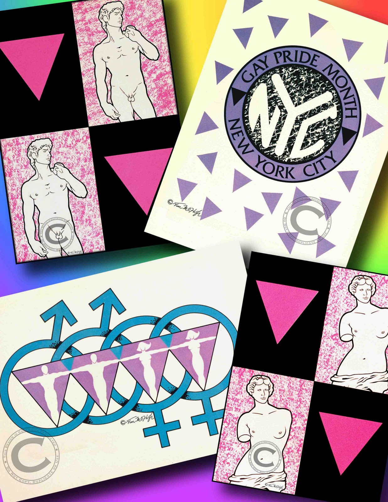
This post, “The Sweat Shop”, was originally painted back in 1994.  However, what you see here is a bit of a hybrid.  The black line work was painted in 1994, but the color was applied recently using Photoshop.  The coloring was kept the same for nostalgic reasons and also to keep the original copyright in place.

Wednesday, October 12, 2011

International Male

Simply titled “Man #2” back in 1991 for the United States Copyright Office’s Visual Arts Form, I decided to call this painting “International Male” for the blog.  Since the inspiration for this artwork came directly from the pages of the International Male clothing catalog, it seemed fitting to somehow acknowledge the original reference.   
With many of my creations in these first posts, there are aspects of the paintings that I like and aspects that I don’t like.  When coming to terms with a creative style, there is always a period of time when the artist must “work out the bugs”.  It’s an experimental time.  It’s a time for trial and error.  In the late 1980’s and early 1990’s, my main concentration was to solidify my creative style.  Being raised watching cartoons from the 1960’s & 1970’s and aspiring to be a comic book illustrator, I was heavily influenced by flat color that was defined by solid black line work.  Coloring books, animation, comic books, they all had one thing in common: the flat graphic color was defined by the black line work that surrounded it.    
With the exception of “Princess” I have relied on published photos for my inspiration.  “Princess” was inspired by a co-worker at the time that was both statuesque and beautiful.  I simply had to paint her.  “Tex”, “Nagel Boy” and “International Male” were all inspired by published photos of some kind.  But I was quickly getting to the point where I wanted to own the inspiration as well.  I wanted to be able to select and mold my inspiration and not be limited to what was already out there. 
The definition for the word muse is a source of one’s inspiration.  In Greek Mythology, the Muses were the goddesses who inspired the creation of literature and the arts.  I needed a muse.  I needed someone who was so idyllic, his beauty would inspire me to produce greater work.  I needed a model.          

Tuesday, October 11, 2011

Creative Inspiration: Lumberjacks

Each year in early October is the Autumn Timber Festival in Pennsylvania’s Pocono Mountains.  The main attraction are the lumberjacks.  Although it’s the same show year after year, it rarely disappoints.  The crowd is also loaded with eye candy, again, rarely disappointing. 

This past weekend was the annual event and the photos posted above are largely from this year’s festival.  There are a few photos from the previous year, but the important thing is that all the handsome lumberjacks were present and accounted for.  WOOF!

Monday, October 10, 2011

Deforestation 1991

As I mentioned in my previous post, “Deforestation” was originally painted in 1991 using India ink for the line work and the background texture and gouache for the color areas.  I digitally scanned the original art and what you see in this post is essentially that art as it was painted twenty years ago.  That being said, I did use Photoshop to brighten the colors some, add my signature and copyright, but other than those very minor changes, the original art remains unaffected. 

Thursday, October 6, 2011

Deforestation

Originally painted in 1991, what you’re seeing now is a bit of a hybrid.  The black line work and background texture was painted twenty years ago, using India ink and brushes.  And although it was colored similarly back then, the color you see in this version has been applied using Photoshop.  The original colors were painted in gouache. 

This “Nagelesque” style is firmly taking hold, as seen in “Princess”, “Tex” and “Nagel Boy”.  My artwork has always been stylized and graphic.  But after seeing Patrick Nagel’s work, my commitment to this style, which I have often referred to as “high tech coloring book”, is unwavering. 

I have been presenting my work somewhat chronologically, indicating something of a progression.  Hopefully, this progression shows some level of improvement.

Creative Influences: Steve Jobs

"Your time is limited, so don't waste it living someone else's life.
Don't be trapped by dogma - which is living with the results of
other people's thinking.
Don't let the noise of other's opinions drown out your own inner voice.
And most important, have the courage to follow your heart and intuition.
They somehow already know what you truly want to become.
Everything else is secondary."

Steve Jobs
1955-2011 


Monday, September 26, 2011

Nagel Boy

Simply called Man #1 back in 1990 when it was painted, I thought I would update the title for the blog.  This was called Man #1 because it was my very first stab at emulating Patrick Nagel's style and applying it to my vision.  As you can see from the checkerboard background, I was influenced as well by the Memphis design movement.  The reference or inspiration for the man was from a black and white newspaper advertisement, most likely the Sunday New York Times Magazine.  I like the design of the leather jacket's lining, pseudo Memphis design-y.     

Memphis design originated in Italy in the early 1980's and held on tight for most of that decade.  The bold geometric shapes and bright primary colors that were the foundation for this design movement could be seen everywhere from music videos to home furnishings and decor items.

"Nagel Boy" is painted on illustration board using a combination of gouache and India ink.  This painting measures approximately 20" x 22". 

Sunday, September 25, 2011

Creative Influences: Patrick Nagel

One of the main creative influences on my work is American artist Patrick Nagel (November 25, 1945 – February 4, 1984)He created popular illustrations in the 1970’s and 1980’s, most of which emphasize the simple grace and beauty of the female form.  He is best known for his illustrations that appeared in Playboy magazine.  

In 1972, he began work as a freelance artist for major corporations and magazines, including Architectural Digest, Harper's Magazine, IBM, ITT Corporation, Intel, Lucky Strike cigarettes, Ballentine Whiskey, Budweiser, MGM, Oui, Rolling Stone, United Artists and Universal Studios.  In 1976, Nagel began to regularly create images for Playboy magazine, which greatly improved his exposure and brought much attention to the highly stylized "Nagel Woman".  In 1978, he made the first of many posters for Mirage Editions.  Nagel's 1982 painting for Duran Duran's album cover "Rio" would become one of his best known images. 

According to Elena G. Millie, curator of the poster collection at the Library of Congress:
Like some of the old print masters (Toulouse-Lautrec and Bonnard, for example), Nagel was influenced by the Japanese woodblock print, with figures silhouetted against a neutral background, with strong areas of black and white and with bold lines and unusual angles of view.  He handled colors with rare originality and freedom, he forced perspective from flat, two-dimensional images and he kept simplifying, working to get more across with fewer elements.  His simple and precise imagery is also reminiscent of the art-deco style of the 1920s and 1930s- its sharp linear treatment, geometric simplicity and stylization of form yield images that are formal yet decorative.

Nagel would start with a photograph and work down, always simplifying and removing elements which he felt were unnecessary.  The resulting image would look flat, but emphasized those elements which he believed were most important.  Nagel's figures generally have black hair, white skin, full lips and the distinctive Nagel eyes, which are often squared off in his later works.  Because of the intense stylization and simplification of the facial features, the figures resemble each other, even though Nagel worked with many models, including Playboy playmates Cathy St. George, Tracy Vaccaro and Shannon Tweed.  Nagel also painted several celebrity portraits including Joan Collins (whose portrait was subsequently released as a limited edition print) and Joanna Cassidy.

Nagel did paint men, but only one was ever released as a fine art print while he was alive.  Nagel continues to have a devoted following of collectors.

Friday, September 23, 2011

Gay Pride T-Shirts

In 1992 I designed and sold T-shirts celebrating gay pride.  These 4 designs were screen printed on shirts and sold in stores from Boston to Washington, D.C.  To think that my designs would be purchased by gay men and women was an incredible thrill for me.  In addition to the shirts being sold in gay bookstores, that year I purchased a booth at New York City's Gay Pride parade and sold my T-shirts as one of the parade vendors.  That was a very cool experience.  

A few years later, I was at the NYC Gay Pride parade and noticed a woman was wearing one of my T-shirts with the designs I call "Rings" (that would be the turquoise and lavender design in the lower left corner in the above photograph).  As I approached her, I noticed the shirt was both stained and faded.  I asked her where she had gotten that shirt.  Before she could answer, her partner responded with, "Oh my God, this is her favorite shirt, she never takes it off!"  I smiled.  But she responded with a story about how she had bought the shirt a few years back at the parade from a guy who had a booth and was selling them.  I told her I was that guy, and she demanded I sign the shirt.  She whipped out a Sharpie and I signed the shirt...right on her chest.  
What an incredible thrill!  Seriously! 

Thursday, September 22, 2011

Tex

 
Created back in 1990, this piece much like the painting in the previous post, also uses a recognizable geographic shape as a backdrop and main design element.   

"Tex" is painted on illustration board using a combination of gouache and India ink.  This painting measures approximately 20" x 22".

Wednesday, September 21, 2011

Princess

Created back in 1991, twenty years ago, this piece still remains one of my favorite paintings.  The combination of animals and people is a theme I was incorporating into my paintings back then.  And although I think this painting is very pleasing, it actually makes little sense as the tiger's range does not include the continent of Africa.

"Princess" is painted on illustration board using a combination of gouache and India ink.  This painting measures approximately 20" x 22". 

Copyright & Copyright Infringement

I’ve been thinking about what the subject of my first post should be, and although I don’t want it to be a downer, I need to talk a little about copyrights and copyright infringement.  When an artist takes the time to create something, it is usually created with much passion and dedication.  That work, should be protected.  It was created with the artist’s talent and conviction.  That work is the artist’s possession.  It belongs to the artist.  The artist owns that creation.  He should control the distribution of that artwork.

I started this blog because many of you have been asking where you can view my artwork.  I hope you all will enjoy this site, perhaps my ramblings and of course, the artwork.  I hope this blog is a place where you want to come back repeatedly to see what’s new.  

That being said, all of my work is protected by copyright laws, both domestic laws and international laws.  All artwork and images posted on this blog are protected and can not be reproduced, copied, duplicated or used in whole or in part. 

Enjoy the art and thank you for your cooperation.